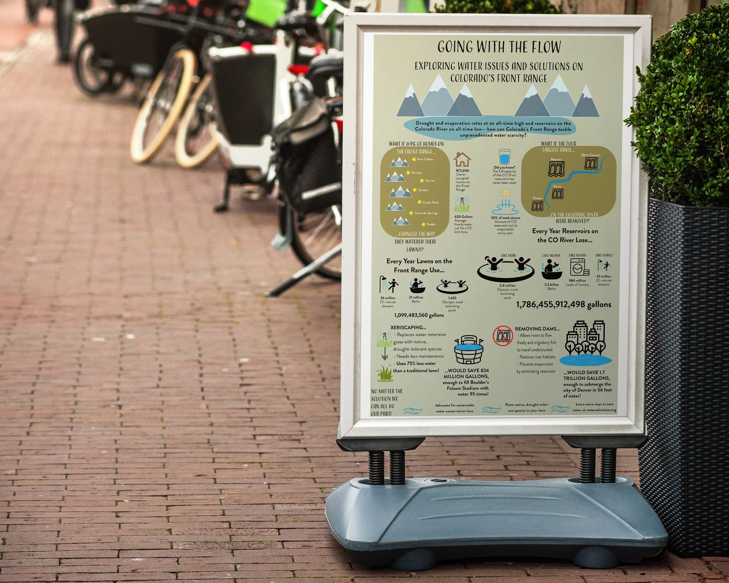
A water-wise infographic.
Adobe Illustrator; Google Sheets
How do we as designers get people to care? How can our skills bridge the gap between facts and emotion?
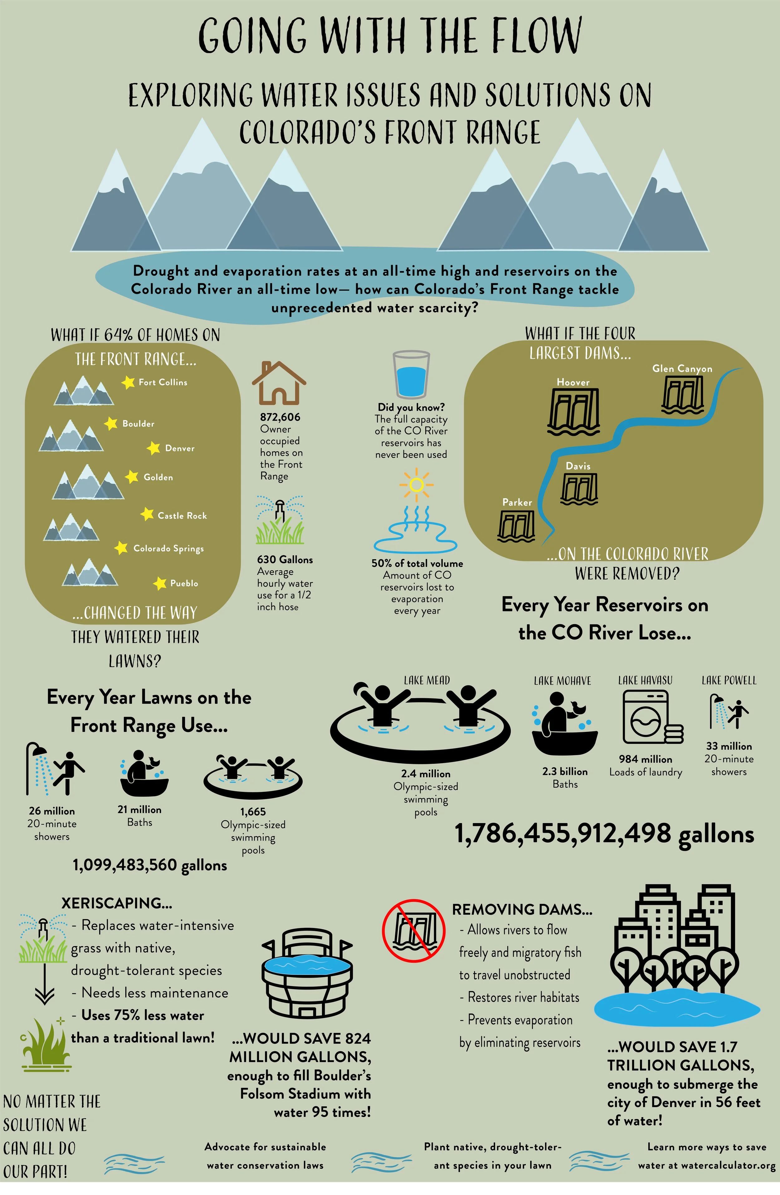
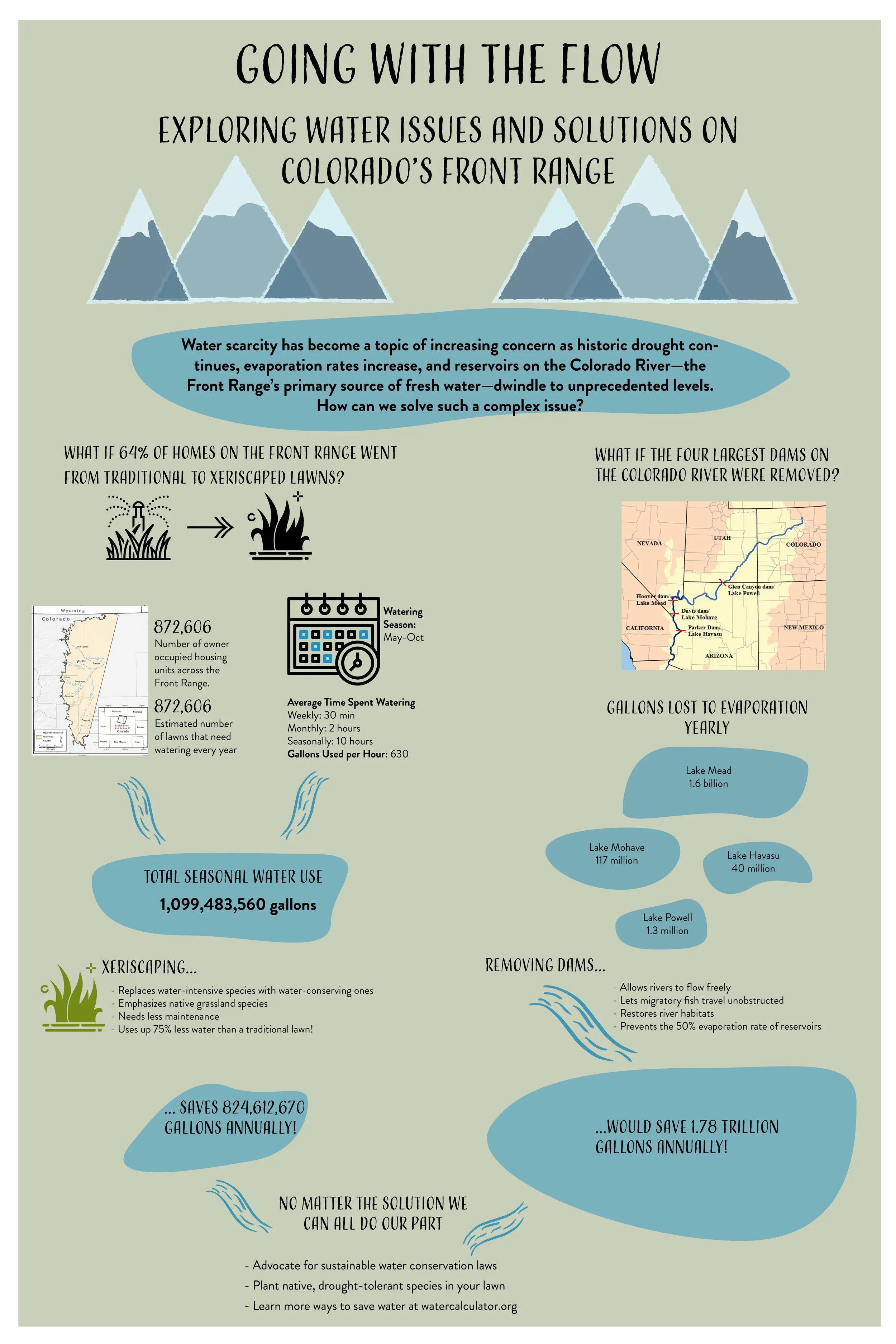
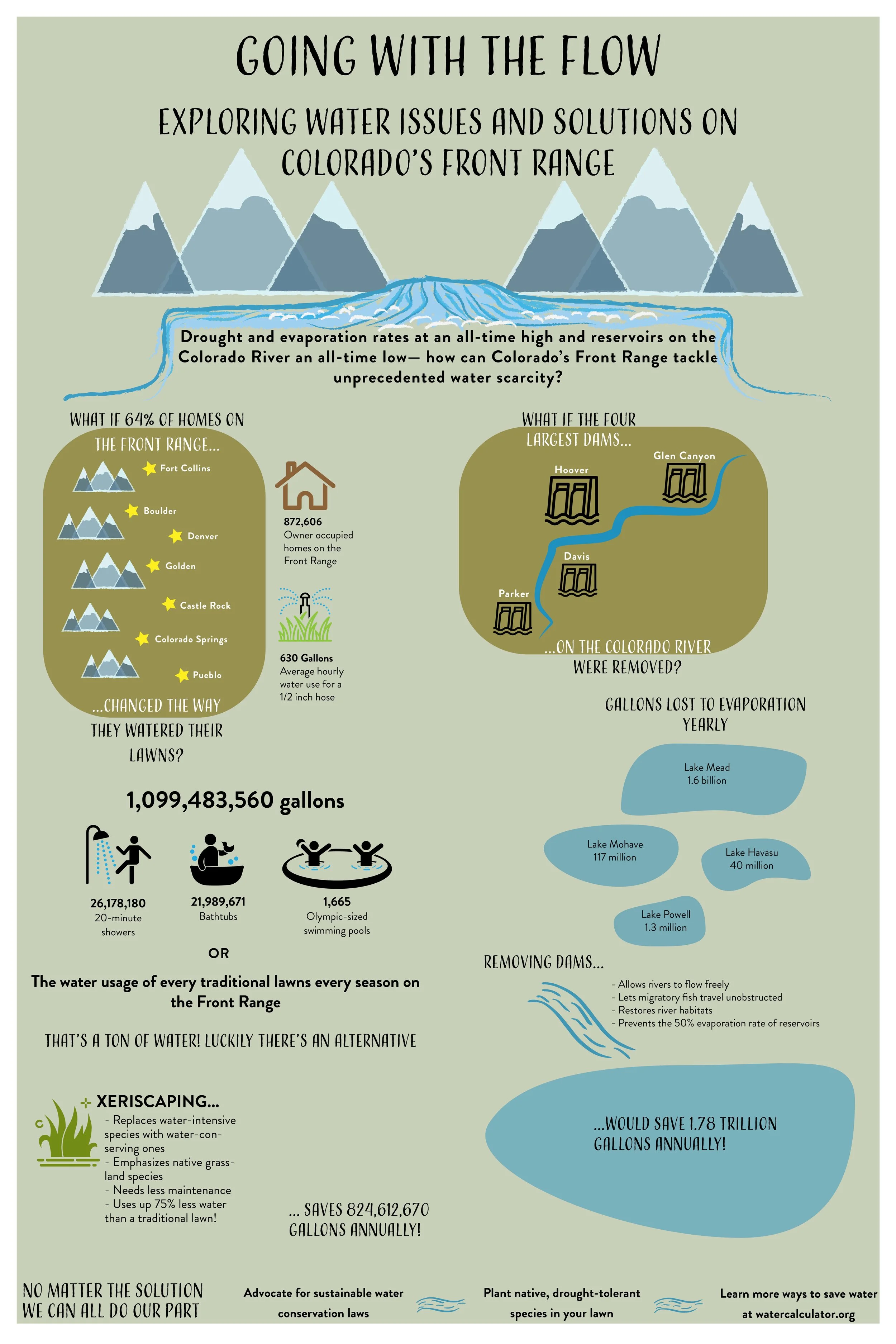
Grappling with these questions helped me create this data visualization exploring water issues in the West. Living in Colorado, it’s an issue close to home and growing closer every year.
Visually pleasing and informative, this infographic allows viewers to grasp the magnitude of a major environmental issue without being overwhelmed by it.
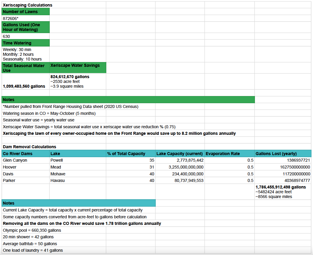
Gather Data
Using existing data and my own calculations, I determined the quantitative impact of two different approaches to water conservation in the West: xeriscaping the lawns of every homeowner on the Front Range or removing the four largest dams on the Colorado River.
Organize Data
This project challenged me to present dry facts and figures in an attractive way, catching the viewer’s eye while giving them something deeper to think about. After the initial ideation phase, I went through several layouts before settling on one that felt visually effective.
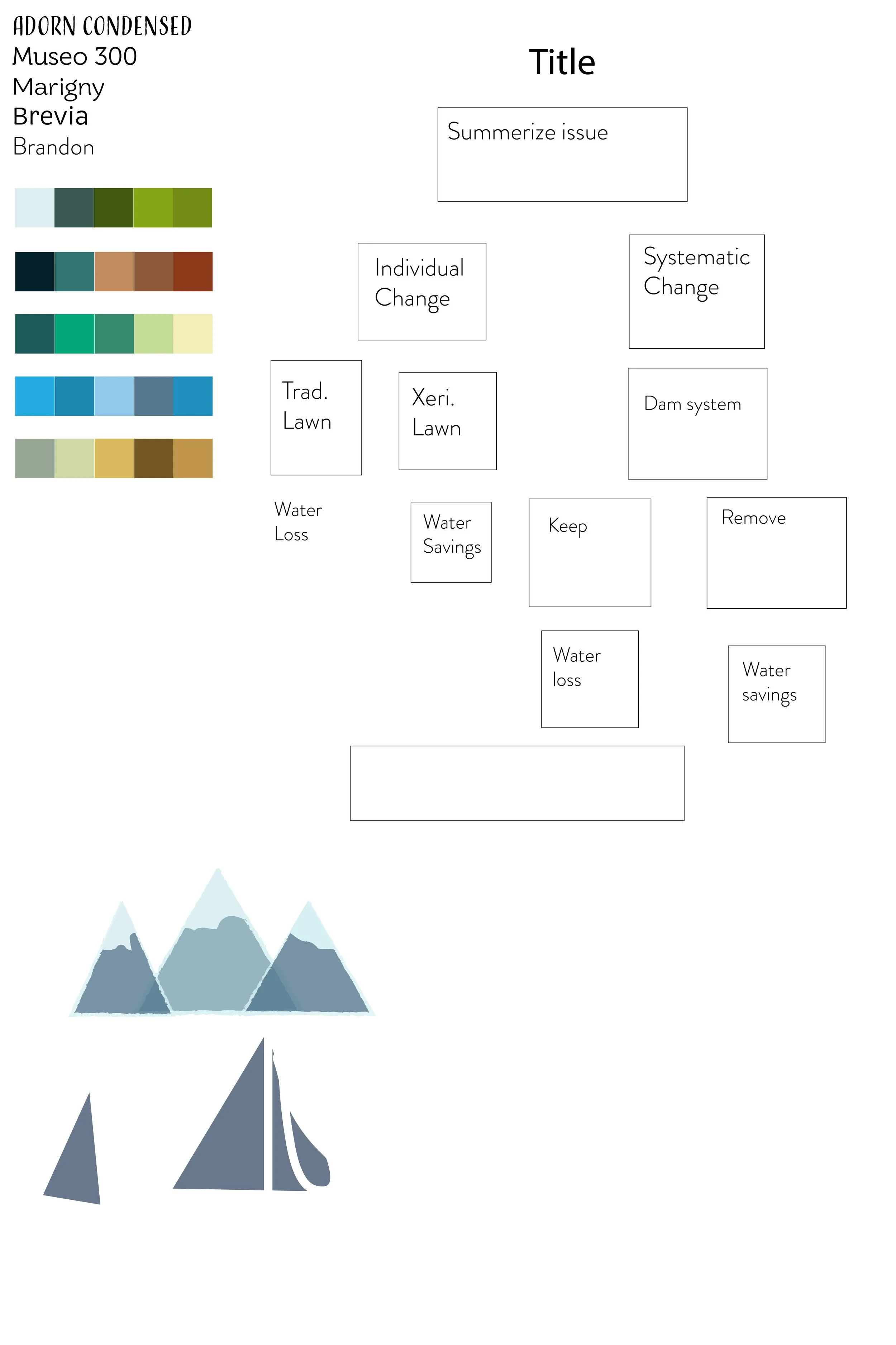
Beautify Data
For the final design, I considered the style, color scheme, and how best to highlight key information without overwhelming the viewer. The final design makes ample use of graphics without compromising important factual information, funneling the viewer’s eye from information to impact to action.